
Introduction
Angular Material is a set of high-quality UI components developed by the Angular team-based Google Material design specification. These UI components help us to build a single, good-looking UI that spans across multiple devices.
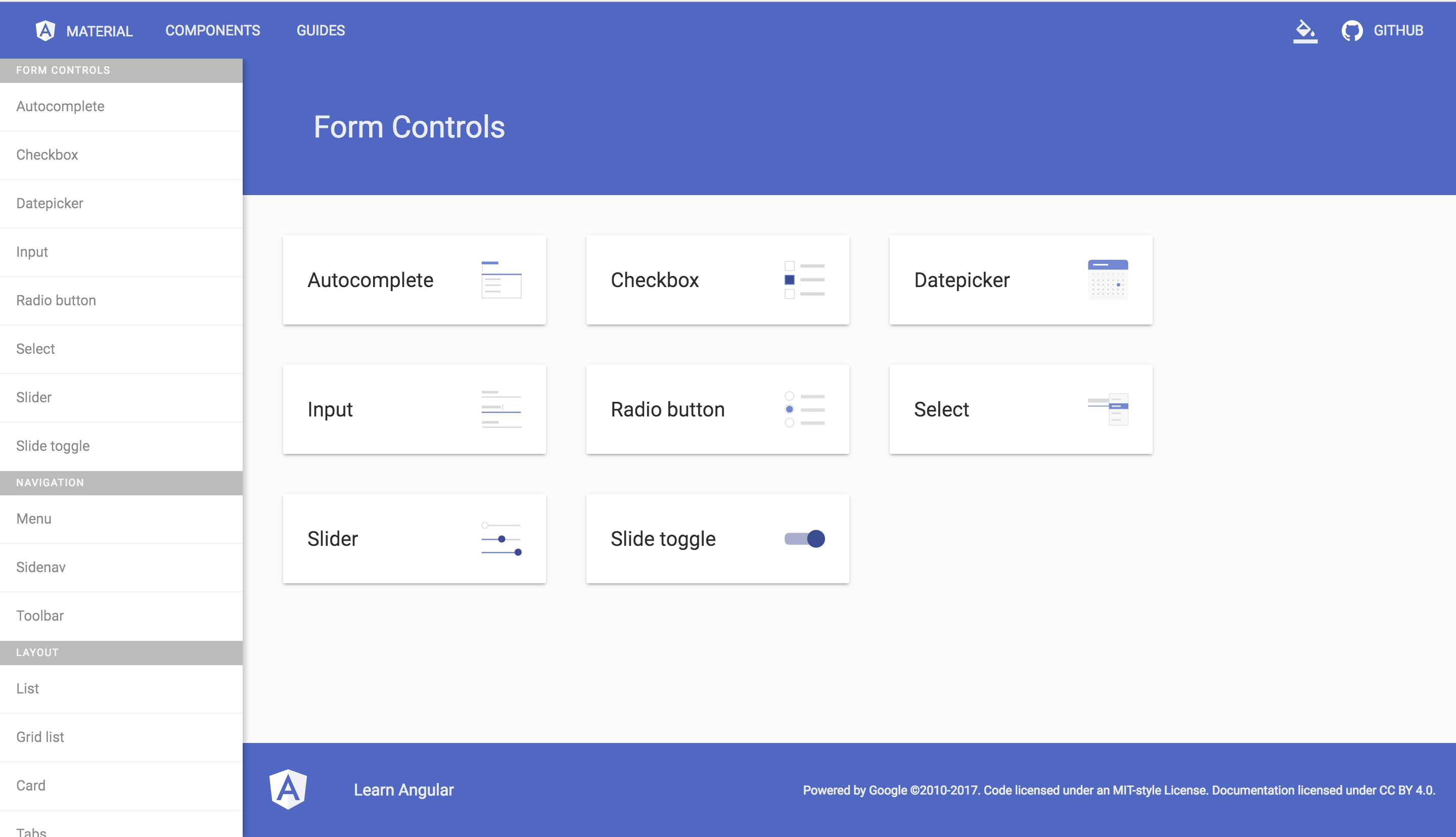
Angular Material Form Control Components
In this angular tutorial, you will learn How to setup material Design In your Angular App. In the course of this tutorial, we will be using Angular IDE. Let’s get started by firing up our Angular IDE and create a new Angular project named AngularMaterialTutorial.

Create new project
Install Angular Material and it’s Dependencies
Once the project is created we can now install additional node_modules to our project. Angular IDE has a terminal view from which we can execute commands, so from the menu select Window, then Show view then click Terminal+. In the opened terminal type the following commands to install HammerJS, Angular Animations, Angular Material and Angular CDK.
npm install --save hammerjs @angular/animations @angular/material @angular/cdk
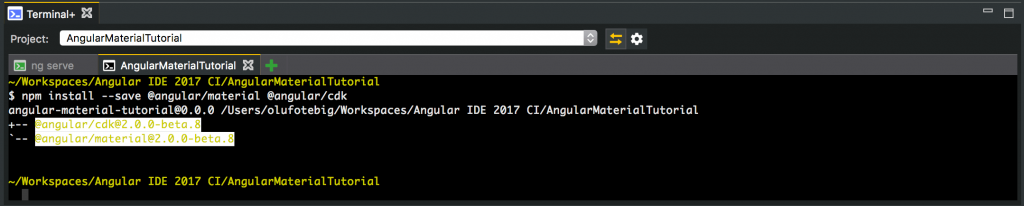
Terminal+
We installed Angular Animations because some of the Angular Material components depends on the Angular animations module for advanced transitions. We also installed HammerJS because some of the Angular Material components such as MdTooltip and MdSlider depend on HammerJS for gestures.
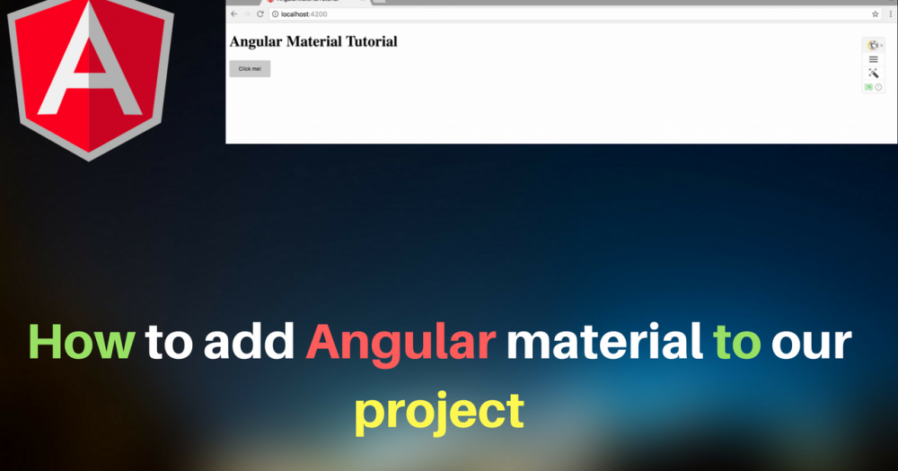
Replace the content of src\app\app.component.html with the an h1 tag with text content Angular Material Tutorial, and start the development server by clicking the green play button in the server window. Now we can open our project in our browser by navigating to gttp://localhost:4200.
<h1>Angular Material Tutorial</h1>
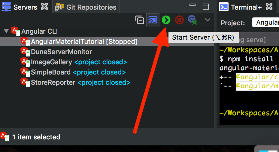
Start server
Using Angular Material Components
Let us see how to use the Angular Material Components in our code, by adding a button to our page. First we update src\app\app.module.ts, by import importing the Angular Material Button Module–MdButtonModule and adding it to the imports array. Also we update src\app\app.component.html by including the markup for Angular Material Button component <button>Click me!</button>
The snippets below show code updates:
/*src\app\app.module.ts*/

import {MdButtonModule} from '@angular/material';
//...
    imports:[
        //...,
        MdButtonModule
    ]
<!-- src\app\app.component.html -->
<h1>Angular Material Tutorial</h1>
<button md-button>Click me!</button>
In the browser you should see a material button added.
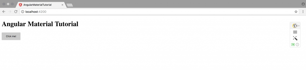
Material Button
Using Material Theme
Under the node_modules/@angular/material/prebuilt-themes folder, we have the following four out-of-the-box themes available:
deeppurple-amberindigo-pinkpink-bluegreypurple-green
These are default themes the ones used by Google on most of their services that we can use directly. To do so, add the following line to your /src/styles.css file
@import "~@angular/material/prebuilt-themes/purple-green.css";
To better see the effect of the added theme, let us change the color of the button and add a floating action button to src\app\app.component.html, bu updating as follow:
<h1>Angular Material Tutorial</h1>
<button md-button color="primary">Click me!</button>
<button md-fab>Click me!</button>
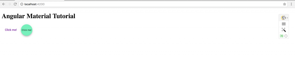
button and fab
Conclusion
Angular Material is Finely tuned for performance & Fully tested across modern browsers. It’s capabilities are very powerful and as of right now, it seems to be the only UI component library that gets it fairly right.