How to develop user interface with Angular 2
Angular 2 is inspired by modern web standards, especially Web Components, which led to the adoption of some of the methods of content projection used there. In this article, we’ll look at them in the context of Angular 2 using the ng-content directive
Content projection is an important concept when developing user interfaces. It allows us to project pieces of content into different places of the user interface of our application. Web Components solve this problem with the content element. In AngularJS 1.x, it is implemented with the infamous transclusion.
Basic content projection in Angular 2
Let’s suppose we’re building a component called fancy-button. This component will use the standard HTML button element and add some extra behavior to it. Here is the definition of the fancy-button component:
@Component({
  selector: 'fancy-button',
  template: '<button>Click me</button>'
})
class FancyButton { … }
Inside of the @Component decorator, we set the inline template of the component together with its selector. Now, we can use the component with the following markup:
<fancy-button></fancy-button>
On the screen, we are going to see a standard HTML button that has a label with the content Click me. This is not a very flexible way to define reusable UI components. Most likely, the users of the fancy button will need to change the content of the label to something, depending on their application.
In AngularJS 1.x, we were able to achieve this result with ng-transclude:
// AngularJS 1.x example
app.directive('fancyButton', function () {
  return {
    restrict: 'E',
    transclude: true,
    template: '<button><ng-transclude></ng-transclude></button>'
  };
});
In Angular 2, we have the ng-content element:
// dunebook4/ts/ng-content/app.ts
@Component({
  selector: 'fancy-button',
  template: '<button><ng-content></ng-content></button>'
})
class FancyButton { /* Extra behavior */ }
Now, we can pass custom content to the fancy button by executing this:
<fancy-button>Click <i>me</i> now!</fancy-button>
As a result, the content between the opening and the closing fancy-button tags will be placed where the ng-content directive resides.
Projecting multiple content chunks
Another typical use case of content projection is when we pass content to a custom Angular 2 component or AngularJS 1.x directive and we want different parts of this content to be projected to different locations in the template.
For instance, let’s suppose we have a panel component that has a title and a body:
<panel>
  <panel-title>Sample title</panel-title>
  <panel-content>Content</panel-content>
</panel>
And we have the following template of our component:
<div class="panel">
  <div class="panel-title">
    <!-- Project the content of panel-title here -->
  </div>
  <div class="panel-content">
    <!-- Project the content of panel-content here -->
  </div>
</div>`
In AngularJS 1.5, we are able to do this using multi-slot transclusion, which was implemented in order to allow us to have a smoother transition to Angular 2. Let’s take a look at how we can proceed in Angular 2 in order to define such a panel component:
// dunebook4/ts/ng-content/app.ts
@Component({
  selector: 'panel',
  styles: [ … ],
  template: `
    <div class="panel">
      <div class="panel-title">
        <ng-content select="panel-title"></ng-content>
      </div>
      <div class="panel-content">
        <ng-content select="panel-content"></ng-content>
      </div>
    </div>`
})
class Panel { }
We have already described the selector and styles properties, so let’s take a look at the component’s template. We have a div element with the panel class, which wraps the two nested div elements, respectively: one for the title of panel and one for the content of panel. In order to grab the content from the panel-title element and project it where the title of the panel is supposed to be in the rendered panel, we need to use the ng-content element with the selector attribute, which has the panel-title value. The value of the selector attribute is a CSS selector, which in this case is going to match all the panel-title elements that reside inside the target panel element. After this, ng-content will grab their content and set them as its own content.
Nesting components
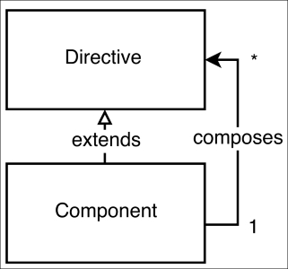
We’ve already built a few simple applications as a composition of components and directives. We saw that components are basically directives with views, so we can implement them by nesting/composing other directives and components. The following figure illustrates this with a structural diagram:
The composition could be achieved by nesting directives and components within the components’ templates, taking advantage of the nested nature of the used markup. For instance, let’s say we have a component with the
sample-component selector, which has the following definition:
@Component({
  selector: 'sample-component',
  template: '<view-child></view-child>'
})
class Sample {}
The template of the sample-component selector has a single child element with the tag name view-child.
On the other hand, we can use the sample-component selector inside the template of another component, and since it can be used as an element, we can nest other components or directives inside it:
<sample-component>
  <content-child1></content-child1>
  <content-child2></content-child2>
</sample-component>
This way, the sample-component component has two different types of successors:
- The successor defined within its template.
- The successor that is passed as nested elements between its opening and closing tags.
In the context of Angular 2, the direct children elements defined within the component’s template are called view children and the ones nested between its opening and closing tags are called content children.
Using ViewChildren and ContentChildren
Let’s take a look at the implementation of the Tabs component, which uses the following structure:
    <tabs (changed)="tabChanged($event)">
      <tab-title>Tab 1</tab-title>
      <tab-content>Content 1</tab-content>
      <tab-title>Tab 2</tab-title>
      <tab-content>Content 2</tab-content>
    </tabs>
The preceding structure is composed of three components:
- The
Tabcomponent. - The
TabTitlecomponent. - The
TabContentcomponent.
Let’s look at the implementation of the TabTitle component:
@Component({
  selector: 'tab-title',
  styles: […],
  template: `
    <div class="tab-title" (click)="handleClick()">
      <ng-content></ng-content>
    </div>
  `
})
class TabTitle {
  tabSelected: EventEmitter<TabTitle> =
    new EventEmitter<TabTitle>();
  handleClick() {
    this.tabSelected.emit(this);
  }
}
There’s nothing new in this implementation. We define a TabTitle component, which has a single property called tabSelected. It is of the type EventEmitter and will be triggered once the user clicks on the tab title.
Now, let’s take a look at the TabContent component:
@Component({
  selector: 'tab-content',
  styles: […],
  template: `
    <div class="tab-content" [hidden]="!isActive">
      <ng-content></ng-content>
    </div>
  `
})
class TabContent {
  isActive: boolean = false;
}
This has an even simpler implementation—all we do is project the DOM passed to the tab-content element inside ng-content and hide it once the value of the isActive property becomes false.
The interesting part of the implementation is the Tabs component itself:
// dunebook4/ts/basic-tab-content-children/app.ts
@Component({
  selector: 'tabs',
  styles: […],
  template: `
    <div class="tab">
      <div class="tab-nav">
        <ng-content select="tab-title"></ng-content>
      </div>
      <ng-content select="tab-content"></ng-content>
    </div>
  `
})
class Tabs {
  @Output('changed')
  tabChanged: EventEmitter<number> = new EventEmitter<number>();

  @ContentChildren(TabTitle)
  tabTitles: QueryList<TabTitle>;

  @ContentChildren(TabContent)
  tabContents: QueryList<TabContent>;

  active: number;
  select(index: number) {…}
  ngAfterViewInit() {…}
}
In this implementation, we have a decorator that we haven’t used yet—the @ContentChildren decorator. The @ContentChildren property decorator fetches the content children of the given component. This means that we can get references to all TabTitle and TabContent instances from within the instance of the Tabs component and get them in the order in which they are declared in the markup. There’s an alternative decorator called @ViewChildren, which fetches all the view children of the given element. Let’s take a look at the difference between them before we explain the implementation further
In next chapter you learn about .. ViewChild versus ContentChild
ViewChild versus ContentChild
Although both concepts sound similar, they have quite different semantics. In order to understand them better, let’s take a look at the following example:
// dunebook4/ts/view-child-content-child/app.ts
@Component({
  selector: 'user-badge',
  template: '…'
})
class UserBadge {}

@Component({
  selector: 'user-rating',
  template: '…'
})
class UserRating {}
Here, we’ve defined two components: UserBadge and UserRating. Let’s define a parent component, which comprises both the components:
@Component({
  selector: 'user-panel',
  template: '<user-badge></user-badge>',
  directives: [UserBadge]
})
class UserPanel {…}
Note that the template of the view of UserPanel contains only the UserBadge component’s selector. Now, let’s use the UserPanel component in our application:
@Component({
  selector: 'app',
  template: `<user-panel>
    <user-rating></user-rating>
  </user-panel>`,
  directives: [CORE_DIRECTIVES, UserPanel, UserRating]
})
class App {
  constructor() {}
}
The template of our main App component uses the UserPanel component and nests the UserRating component inside it. Now, let’s suppose we want to get a reference to the instance of the UserRating component that is used inside the user-panel element in the App component and a reference to the UserBadge component, which is used inside the UserPanel template. In order to do this, we can add two more properties to the UserPanel controller and add the @ContentChild and @ViewChild decorators to them with the appropriate arguments:
class UserPanel {
  @ViewChild(UserBadge)
  badge: UserBadge;

  @ContentChild(UserRating)
  rating: UserRating;
  constructor() {
    //
  }
}
The semantics of the badge property declaration is this: “get the instance of the first child component of the type UserBadge, which is used inside the UserPanel template”. Accordingly, the semantics of the rating property’s declaration is this: “get the instance of the first child component of the type UserRating, which is nested inside the UserPanel host element”.
Now, if you run this code, you’ll note that the values of the badge and rating properties are still equal to the undefined value inside the controller’s constructor. This is because they are still not initialized in this phase of the component’s life cycle. The life cycle hooks that we can use in order to get a reference to these child components are ngAfterViewInit and ngAfterContentInit. We can use these hooks simply by adding definitions of the ngAfterViewInit and ngAfterContentInit methods to the component’s controller. We will make a complete overview of the life cycle hooks that Angular 2 provides shortly.
To recap, we can say that the content children of the given components are the child elements that are nested within the component’s host element. In contrast, the view children directives of the given component are the elements used within its template.
Note
In order to get platform independent reference to a DOM element, again, we can use @ContentChildren and @ViewChildren. For instance, if we have the following template: <input #todo> we can get a reference to the input by using: @ViewChild('todo').
Since we are already familiar with the core differences between view children and content children now, we can continue with our tabs implementation.
In the tabs component, instead of using the @ContentChild decorator, we use @ContentChildren. We do this because we have multiple content children and we want to get them all:
@ContentChildren(TabTitle)
tabTitles: QueryList<TabTitle>;

@ContentChildren(TabContent)
tabContents: QueryList<TabContent>;
Another main difference we can notice is that the types of the tabTitles and tabContents properties are QueryList with the respective type parameter and not the component’s type itself. We can think of the QueryList data structure as a JavaScript array—we can apply the same high-order functions (map, filter, reduce, and so on) over it and loop over its elements; however, QueryList is also observable, that is, we can observe it for changes.
As the final step of our Tabs definition, let’s take a peek at the implementation of the ngAfterContentInit and select methods:
ngAfterContentInit() {
  this.tabTitles
    .map(t => t.tabSelected)
    .forEach((t, i) => {
      t.subscribe(_ => {
        this.select(i)
      });
    });
  this.active = 0;
  this.select(0);
}
In the first line of the method’s implementation, we loop all tabTitles and take the observable’s references. These objects have a method called subscribe, which accepts a callback as an argument. Once the .emit() method of the EventEmitter instance (that is, the tabSelected property of any tab) is called, the callback passed to the subscribe method will be invoked.
Now, let’s take a look at the select method’s implementation:
select(index: number) {
  let contents: TabContent[] = this.tabContents.toArray();
  contents[this.active].isActive = false;
  this.active = index;
  contents[this.active].isActive = true;
  this.tabChanged.emit(index);
}
In the first line, we get an array representation of tabContents, which is of the type QueryList<TabContent>. After that, we set the isActive flag of the current active tab to false and select the next active one. In the last line in the select method’s implementation, we trigger the selected event of the Tabs component by invoking this.tabChanged.emit with the index of the currently selected tab.