13 Best Bootstrap Alternatives
Bootstrap is a popular front-end development framework now days used by developers to design generic design for rapid prototyping.
Along with bootstrap one other framework like skeleton and foundation.
These three platforms are ideal for many designers with multiple and complex tasks to accomplish but say with a little time allocated.
This kind of situation triggers a second thought in developers’ minds for a better resort.
However, some situations like complexities would compel designers to opt for alternatives of bootstrap and the other two in order to reduce the design’s complexity.
Following is a list of 13 best bootstrap alternatives to have a look at instead.
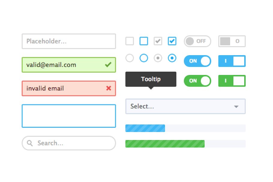
1. Pure.css
This is a set of small but responsive CSS modules suitable for your use in the web design project. Pure is ridiculously minified and zipped; the entire module set is 3.8k.it is definite that it was crafted with a mobile device in mind.
It is built on normalize.CSS and it provides layout and styling for HTML native and common UI components.
It s minimal style encourages one to write their application style on top. It is pretty easy to override styles. Pure.css uses grid menus and more to create a responsive layout for a variety of screen sizes.
2. Simple grid
Simple grids are built with responsive sites in mind, lightweight and simply a grid and not a framework with forms and buttons, etc and are designed to sites great looking.
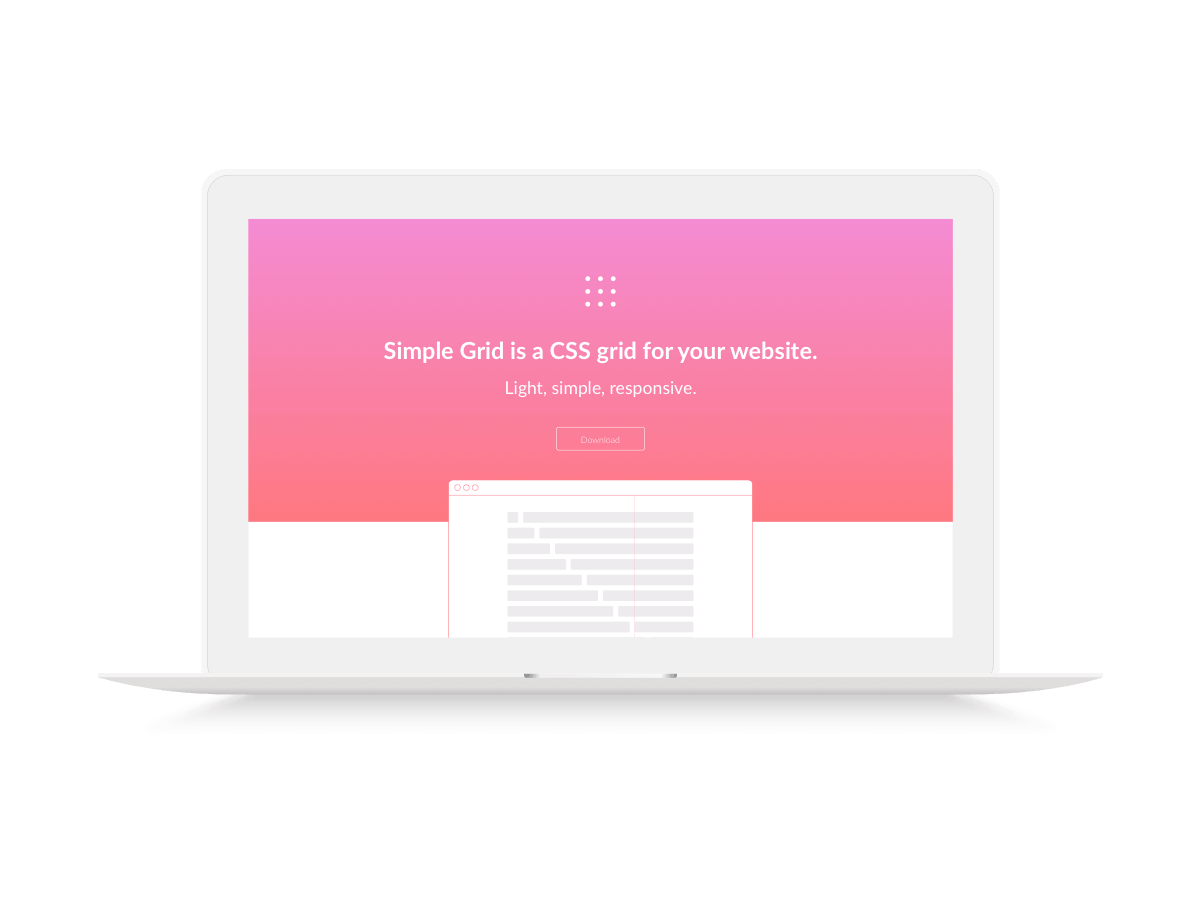
It has twelve common structure to divide them into columns of 2, 3, 6, etc. it helps designers o customize their products swiftly with its weightless and 12 columns inbuilt layout.
3. HTML5 Boilerplate
It is one of the most popular front-end templates that help designers build a robust, fast and adaptable web app.
You can save time and create confidence when you build websites with HTML5 Boilerplate. Its apache settings deliver a site performance.

It is a collective web developer in the industry to ensure website performance.
4. Unsemantic
Unsemantic is a fluid grid system a successor of 960.gs instead of a set of a number of columns it bases on percentages, for example, if you need a column that is 50% wide simply class=”grid-50″. It has grid class multiples of 5, 15, 95 to 100 and grid classes for thirds i.e. grid-33 and grid-66.
You can use the visual layout of a page without affecting the order-“source”.
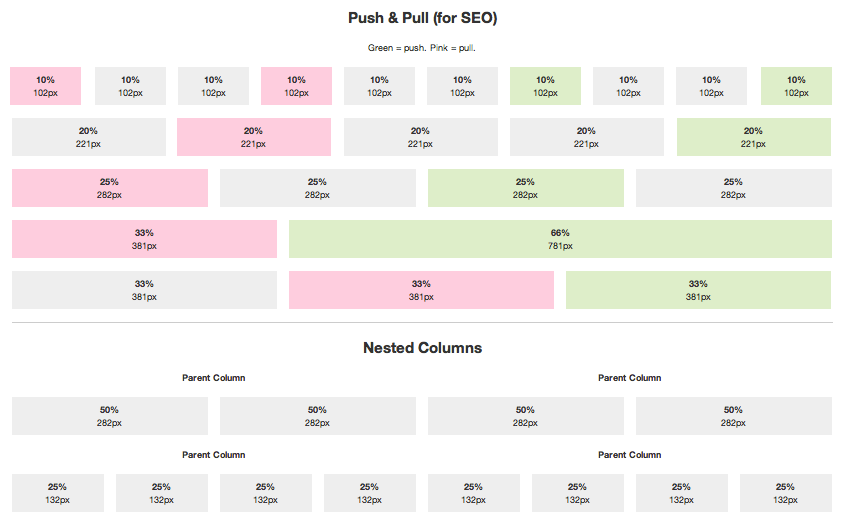
It is proved that it assists the search engines in determining the relevant content hence SEO oriented because search engines focus most on top of the pages.
Additionally, unsemantic is built with sass to extend your CSS.
5. INK
Ink eases developers hard hustle by providing some reusable components which include data picker, tables, gallery and much more.
Its form validator works faster and can be used to develop effective websites and I prototyping.
Ink is highly responsive from the ground up and very easy to code and read hence teams can easily collaborate during development.ink developed their own JavaScript library based on the latest coding standards and modular architecture.
6.Base
Base is built for mobile-first to ensure compatibility wall devices across the board. It has a good foundation to ensure it is all basic styles are set.
It is consistent and perfected to work on all modern browsers.
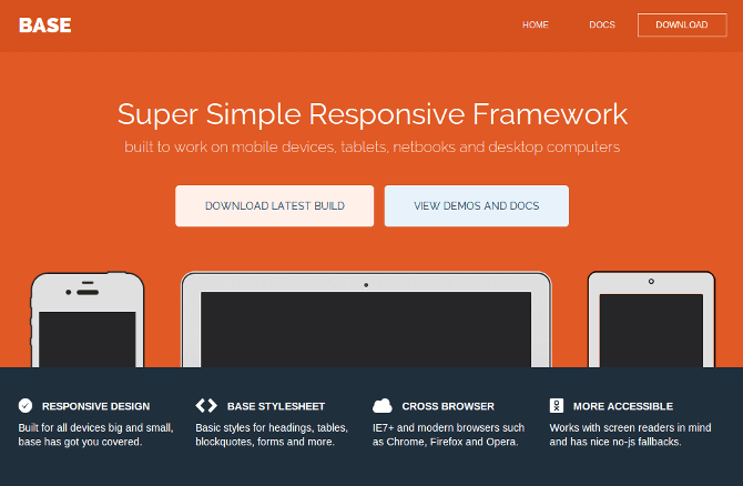
Its code is built on a modular basis to ensure you can add what you want or remove another module. Furthermore, it automates sensation which includes a web pack configuration to automate workflow since built to go-live
7. Material UI
Web developers using material UI should first all, familiarize themselves with react programming basics.
Material UI components help developers in customizing their WebPages without a struggle.
The good thing with material UI is that it works perfectly without additional setup which could pollute the global scope.
Get extras by going premium and get yourself custom themes built on material UI.
8. Materialize
Materialize just like material UI was designed based on Google’s material design.
It is a responsive framework that is great in speed and it’s mainly used to build the specified awesome user experience.
it has detailed documentation and specific code samples to make it easy to get started with.
9. Basscss
BassCSS has a wonderful collection of elements and immutable well-created utilities suitable for websites that is your performance-focused.
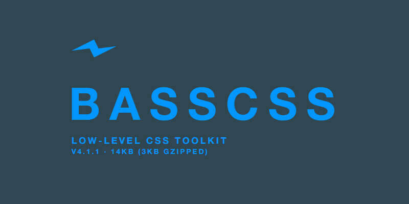
If performance is your goal and lag back is your dislike, go BassCSS way.
10. UI kit
UI Kit is a well-designed set of CSS, HTML and JavaScript components that adds to the desired simplicity, lightweight and flexibility nature of your website.
It supports the modern and the latest versions of browsers. Its UI Kit autocomplete feature with plugins for text editors like Sublime Text and Atom savs time during code production.
11. Groundwork
Groundwork is another alternative to bootstrap with the most responsive HTML, CSS, and JavaScript frameworks, that are used to develop scalable and accessible web apps, that will be deployed across devices.
Its grid system is highly configurable and normally in-built with Sass.
Groundwork is highly customizable and supports rapid prototyping.
12.Cardinal
Cardinal is a CSS framework that was built with mobile-first in mind.
it is highly scalable, modular and great performance-oriented.
13. Jeet
Nowadays, we use things the way machines direct us but not the way we intuit them.
Jeet allows someone to express page grid the same way human beings describe it.
Jeet is faster with less code and more flexible while using it, also it is a clean front-end framework which functions perfectly in modern browsers.
Conclusion
Bootstrap is among the three gigantic frameworks popular in today’s world of web design.
They are meant to make the web developers and web designers work easier.
However, there are alternatives which complement bootstrap if you consider complexity, flexibility, and performance as an issue without compromising the quality and functionality