Create a Login Page in React Native with Animation

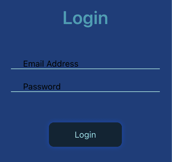
In this article, we are going to learn how to create a login page using React Native. We will also animate the page on button clicks and on focus. This is the final application we will make:
These are the steps we are going to follow –
- Creating a new react application using
react-native init. - Create component for login page.
- Adding form with email and password fields.
- Make it interactive with Animations.
Introduction
For most applications, user authentication is required.
People need to log in to gain access to the apps.
Hence a login form is essential to provide credentials.
Here we are going to learn how to create a login form in react native with some cool animations.
Creating a new react application using react-native init
To create a React native app, you need to have a node installed along with Android SDK and cocoapods. You may learn more about installing the prerequisites from here.
After setting up the environment, we need to run the below command to create an app –
npx react-native init LoginPageThis command will setup all the required directories and code files for the development of Android and iOS apps. Next, let’s enter into this newly created project.
cd LoginPageCreate component for login page
In the src directory, create a JavaScript file with name Login.js.
This is our component where we are going to add the form. The code will be –
import * as React from 'react';
import { Text, View } from 'react-native';

export default function Login() {
   return(
      <View>
         <Text>Login</Text>
      </View>
   );
}
Adding Form with Email and Password Fields
Since we have created our Login component, now its time to add form in it.
Our form will have Login heading, one input field for email address, one input field for password and a form submit button.
We will also add icons to denote that input fields belong to email and password.
Check out this code:
import * as React from 'react';
import { Text, View, TextInput, TouchableNativeFeedback } from 'react-native';
import Icon from 'react-native-vector-icons/MaterialCommunityIcons';

export default function Login() {
  const [email, setEmail] = React.useState('');
  const [pass, setPass] = React.useState('');

  return (
    <View>
      <Text>Login</Text>
      <View>
        <Icon name="email" size={30} />
        <TextInput
          onChangeText={text => setEmail(text)}
          value={email}
          placeholder={'Email Address'}
        />
      </View>
      <View>
        <Icon name="lock" size={30} />
        <TextInput
          onChangeText={text => setPass(text)}
          value={pass}
          placeholder={'Password'}
        />
      </View>
      <View>
        <TouchableNativeFeedback>
          <View>
            <Text>Login</Text>
          </View>
        </TouchableNativeFeedback>
      </View>
    </View>
  );
}
Let’s understand this code. We started by importing React, Text, View, TextInput, TouchableNativeFeedback from react-native package.
Also, we imported Icon from MaterialCommunityIcons file of react-native-vector-icons.
import * as React from 'react';
import { Text, View, TextInput, TouchableNativeFeedback } from 'react-native';
import Icon from 'react-native-vector-icons/MaterialCommunityIcons';
We are setting up two state variables, one for email and another for password. These constants will hold the input values.
const [email, setEmail] = React.useState('');
const [pass, setPass] = React.useState('');
Next, we are rendering Login text, email icon, email input field, lock icon, password field and Login button. This will create the structure of our page.
It still needs styling and enhancements like password fields are not obscured yet, which we will cover next.
Enhancing Usability of Input Fields
Generally, input fields are modified to represent the kind of data they can hold. For example, if an input field is meant to hold email address then we are sure that user will type ‘@’. It might be possible that they wish to autofill it.
Similarly for passwords it is mandatory to obscure the field to keep it secret and safe.
Currently, both input fields are similar and do not qualify for their specific purpose. They are general text inputs. Let’s enhance and add features to them.
For email field, we are going to add these properties –
- Set
textContentType– We will set it to “emailAddress” so that system will know that the particular field is of type email. autoCompleteType– We set it to “email“. This will help the user to auto fill the fields with their stored credentials.clearButtonMode– This is iOS specific. It adds a cross (x) mark at the end of the field to let you erase it with one click.keyboardType– For our field it will be “email-address“. This helps the system to open the keyboard with ‘@’ button on the front so that it is easily accessible to user. Because user is definitely going to need it.returnKeyLabel– It is defined for Android only. React Native suggests using it. It indicates the kind of return key or enter key we wish to display in keyboard. For example here we will have a password field after it, so we can have the return key in our keyboard which indicate that there is another field which we need to fill, i.e. you need to move next. So, here we will use ‘next‘ as value.returnKeyType– This is similar toreturnKeyLabelbut it can be used cross-platform. We set it to ‘next‘ also.
After adding all these properties, our code for email field will look like this –
<TextInput
          textContentType={'emailAddress'}
          onChangeText={text => setEmail(text)}
          value={email}
          autoCompleteType={'email'}
          clearButtonMode={'while-editing'}
          keyboardType={'email-address'}
          returnKeyLabel={'next'}
          returnKeyType={'next'}
          underlineColorAndroid={'#FF0000'}
          placeholder={'Email Address'}
/>
Similarly, our password field will have these properties but with different values. It will have one extra parameter of secureTextEntry which will obscure the text of this field. Check out the code –
<TextInput
          textContentType={'password'}
          onChangeText={text => setPass(text)}
          value={pass}
          autoCompleteType={'password'}
          clearButtonMode={'while-editing'}
          returnKeyLabel={'done'}
          returnKeyType={'done'}
          underlineColorAndroid={'#FF0000'}
          placeholder={'Password'}
          secureTextEntry={true}
/>
Styling the Login Page
These are the few things we need to do in order to make it more attractive –
- Adding a background color and padding to the page.
- Login heading should be in center and bigger. It should have some decent color.
- Keeping icons and input of the text field in the same line.
- Styling the submit button.
Adding a background color and padding to the page
To style the page, I am going to give a dark blue background and padding of 20 from all sides. Also I will align the children to the center of the page. The code will look like this –
<View
      style={{
        padding: 20,
        backgroundColor: '#133E7C',
        flex: 1,
        justifyContent: 'center',
      }}>
Styling the Login Heading
The heading should be center aligned and bold. I will make it bigger in size for clear visibility. See the code:
<Text style={{
        alignSelf: 'center',
        fontSize: 30,
        marginBottom: 50,
        color: '#22A0B6',
        fontWeight: '600',
}}>Login</Text>
Styling icons and input fields
First of all, the icon and input field needs to be in a single row. So, code for enclosing view will be like this –
<View style={{
        flexDirection: 'row',
        marginBottom: 20,
      }}>
Now since the icon and input field positioned themselves in a row, we will move ahead with styling them. Here is the code –
<Icon name="email" size={30} color={'#9BE6DE'} />
<TextInput
          textContentType={'emailAddress'}
          onChangeText={(text) => setEmail(text)}
          value={email}
          autoCompleteType={'email'}
          clearButtonMode={'while-editing'}
          keyboardType={'email-address'}
          returnKeyLabel={'next'}
          returnKeyType={'next'}
          placeholder={'Email Address'}
          style={{
            flex: 1,
            paddingLeft: 20,
            borderBottomColor: '#9BE6DE',
            borderBottomWidth: 1,
          }}
        />
Styling Submit Button
Here we are replacing the TouchableNativeFeedback component with Pressable so that it will become compatible with both Android and iOS. Also Pressable is recommended by React Native instead of TouchableHighlight. The button will be centered and elevated to give it a nice shadow. Check out the code –
<View style={{
  alignSelf: 'center',
  marginTop: 30,
}}>
  <Pressable>
    <View style={{
	  paddingHorizontal: 50,
	  paddingVertical: 10,
	  borderRadius: 8,
	  elevation: 8,
	  shadowColor: '#0047BB',
	  shadowRadius: 8,
	  backgroundColor: '#0D2534',
	}}>
	  <Text style={{color: '#9BE6DE'}}>Login</Text>
    </View>
  </Pressable>
</View>
Now everything is styled and looking pretty.
Making Login Page Interactive with React Native Animation
First of all, we need to decide what kind of animation we want on the screen. Like, I am thinking to change the background color when the button is pressed. Also, we can convert the button into circular progress bar with a lock icon in the middle.
Oh! one more thing, if you don’t know how animation works in react native then please refer to this guide first and come back to continue making your login page.
There is also a library, React-Spring which you can use for it.
We will start by creating an animation variable and initializing it with a value of 0.
const animationVariable = React.useRef(new Animated.Value(0)).current;Now we will create a function to run animation on this variable and change its value from 0 to 1.
const runAnimation = (toVal) => {
   Animated.spring(animationVariable, {
      toValue : toVal,
      useNativeDriver: false,
   }).start();
}
We have used spring timing function of Animated component. It provides an inbuilt effect without any need of easing.
It’s all set up. Time to make changes in background color of the page but let’s convert our View to Animated.View, otherwise animations won’t run.
<Animated.View
      style={{
        padding: 20,
        backgroundColor: animationVariable.interpolate({
                            inputRange: [0, 1],
                            outputRange: ['#133E7C', '#0D2534'],
                            extrapolate: 'clamp',
                         }),
        flex: 1,
        justifyContent: 'center',
      }}>
Time to animate the button. For this, I have these plans –
- Change shape to circle and update background color.
- Change ‘Login’ text to lock icon.
- Animate a ripple from center.
Change button shape to circle and update background color
This process starts by converting the View into Animated.View. We are also going to change the structure a bit. This is our current button code –
<Pressable>

  <View style={{
	paddingHorizontal: 50,
	paddingVertical: 10,
	borderRadius: 8,
	elevation: 8,
	shadowColor: '#0047BB',
	shadowRadius: 8,
	backgroundColor: '#0D2534',
  }}>

	<Text style={{
	  color: '#9BE6DE',
	}}>Login</Text>

  </View>

</Pressable>
We will remove padding, and use width/height. This is because animation works better with width/height than paddings. Although you can use paddings if you wish but as my preference, I will go with width/height.
Also, pay attention that we set the value of useNativeDriver as false. Native drivers works with few styles only like transform and opacity (Read more).
Let’s update the code according to our discussion –
<Animated.View style={{
            width: 120,
            height: 40,
            alignItems: 'center',
            justifyContent: 'center',
            borderRadius: 8,
            elevation: 8,
            shadowColor: '#0047BB',
            shadowRadius: 8,
            backgroundColor: '#0D2534',
          }}>
We set alignItems and justifyContent to be center. So that Login text and lock icon (which we will add next) could be in center to the button, both horizontally and vertically.
Now I will interpolate the width, height, background and border radius of the button so that it can become circular and change color with animation variable.
Our circular button transformation with have radius of 30. This means the height and width will be 60 and border radius could be anything >30. The code will become this –
<Animated.View style={{
            width: animationVariable.interpolate({
                            inputRange: [0, 1],
                            outputRange: [120, 60],
                            extrapolate: 'clamp',
                          }),
            height: animationVariable.interpolate({
                            inputRange: [0, 1],
                            outputRange: [40, 60],
                            extrapolate: 'clamp',
                          }),
            borderRadius: animationVariable.interpolate({
                            inputRange: [0, 1],
                            outputRange: [8, 60],
                            extrapolate: 'clamp',
                          }),
            elevation: 8,
            shadowColor: '#0047BB',
            shadowRadius: 8,
            backgroundColor: animationVariable.interpolate({
                            inputRange: [0, 1],
                            outputRange: ['#0D2534', '#652EC7'],
                            extrapolate: 'clamp',
                          }),
            alignItems: 'center',
            justifyContent: 'center',
          }}>
Replace Login Text with Lock Icon
When the button gets pressed and turn into circular one, the text should hide and a lock icon replaces it. To accomplish this, we need to make changes in the structure.
Now our button will hold Login text as well as lock icon. Only one will be visible at a time. When button is unpressed, text will be shown and when pressed, icon will be shown. So, they both are at the same place with opposite opacity.
We can have multiple elements at a same place when they are absolutely positioned. You got the idea. Right?
This is our present Login text code –
<Text style={{
              color: '#9BE6DE',
            }}>Login</Text>
Let’s make it absolute and add lock icon part. We will keep everything compatible with Animated.
<Animated.Text style={{
  color: '#9BE6DE',
  position: 'absolute',
}}>Login</Animated.Text>

<Animated.View style={{
	  position: 'absolute',
	}}>
  <Icon name="lock" size={30} color={'#9BE6DE'} />
</Animated.View>
Both icon and Login text overlap with each other because of absolute positioning. It’s time to set the opacity of both icon and text. We need to set visibility of only one, according to button state.
When animationVariable is 0 (i.e. button not pressed) we want text to be visible, but when it is 1, then icon will be visible. See the code –
<Animated.Text style={{
	  color: '#9BE6DE',
	  position: 'absolute',
	  opacity: animationVariable.interpolate({
					inputRange: [0, 1],
					outputRange: [1, 0],
					extrapolate: 'clamp',
				}),
}}>Login</Animated.Text>
<Animated.View style={{
	  position: 'absolute',
	  opacity: animationVariable.interpolate({
					inputRange: [0, 1],
					outputRange: [0, 1],
					extrapolate: 'clamp',
				}),
	}}>
  <Icon name="lock" size={30} color={'#9BE6DE'} />
</Animated.View>
Animate a ripple from center
How a ripple works? It originates from center and reach the outermost surface or loose energy somewhere. That’s why we need a circular element which starts from zero scaling at center and reach scale 1, up to button surface.
This element will be similar to Login text and lock icon. It will be placed below the lock icon so that ripple won’t hide it.
Let’s create this element –
<Animated.View style={{
                  position: 'absolute',
                  width: 60,
                  height: 60,
                  backgroundColor: '#0D2534',
                  borderRadius: 60,
                  opacity: animationVariable.interpolate({
                                inputRange: [0, 1],
                                outputRange: [0, 1],
                                extrapolate: 'clamp',
                            }),
                  transform: [{
                    scale: 0,
                  }],
                }} />
The size of our ripple element is same as circular button because it will scale up to the button surface. We set its opacity to 0 when button is not pressed.
For ripple we will need a different animation variable because this animation will run after the completion of first. Also this will run a bit slow, let say in 1 second. Check the code –
const loginButtonAnimationVariable = React.useRef(new Animated.Value(0)).current;

const runLoginButtonAnimation = (toVal) => {
    Animated.timing(loginButtonAnimationVariable, {
      toValue: 1,
      duration: 1000,
      useNativeDriver: true,
      easing: Easing.bounce,
    }).start();
}
Use this variable to change scale of ripple. We will get this outcome –
<Animated.View style={{
  position: 'absolute',
  width: 60,
  height: 60,
  backgroundColor: '#0D2534',
  borderRadius: 60,
  opacity: animationVariable.interpolate({
				inputRange: [0, 1],
				outputRange: [0, 1],
				extrapolate: 'clamp',
			}),
  transform: [{
	scale: loginButtonAnimationVariable.interpolate({
				inputRange: [0, 1],
				outputRange: [0.3, 1],
				extrapolate: 'clamp',
			}),
  }],
}} />
Everything is setup. Only one thing remains. Running ripple animation after completion of button click animation and after completion of ripple animation revert back button animation. Look at the code –
const runAnimation = (toVal) => {
    Animated.spring(animationVariable, {
        toValue : toVal,
        useNativeDriver: false,
    }).start(() => {
      if(toVal === 1) {
        runLoginButtonAnimation(1);
      }
    });
  }

  const runLoginButtonAnimation = (toVal) => {
    Animated.timing(loginButtonAnimationVariable, {
      toValue: 1,
      duration: 1000,
      useNativeDriver: true,
      easing: Easing.bounce,
    }).start(() => {
      runAnimation(0);
      loginButtonAnimationVariable.setValue(0);
    });
  }
That’s it. Completed. Check the complete demo.
Conclusion
With this article, we learned a lot of new concepts especially in react native forms and animation. Here we created everything by scratch but you can use libraries like react-hook-form and react-spring.