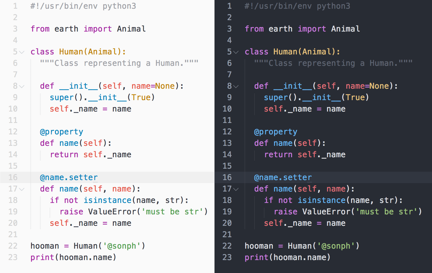
Top 21 Vim Themes in 2024: Elevate Your Coding Experience
In this article, we’re going to explore the top 21 Vim themes that you can choose from to elevate your coding experience.
Vim is an open-source and free text editor that operates like any other text editor, for example, Notepad ++ and Sublime.
To run Vim, one needs to use the command-line interface (CLI) or else a graphical user interface, which is GUI.
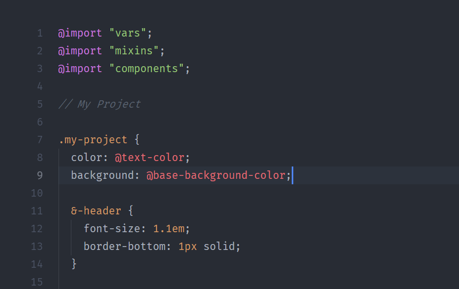
When we use the word themes, it is basically Vim color schemes, which lets you combine colors to create an appealing aesthetic when you use them. These best vim color schemes are ready-to-use.
How to install Vim color schemes
Installing a Vim theme can be done in a few simple steps:
- Download the theme: Most Vim themes can be downloaded from popular Vim script repositories such as Vim Awesome or GitHub. The theme should be in the form of a Vim script file with a
".vim"extension. - Place the theme in the “colors” directory: Create a “colors” directory in your Vim configuration directory (usually located in
"~/.vim/colors"or"$HOME/vimfiles/colors"on Windows) and copy the downloaded Vim script file to this directory. - Add a colorscheme command in your Vim configuration file: Open your Vim configuration file (usually located in
"~/.vimrc" or "$HOME/_vimrc"on Windows) and add the following line to specify the theme you want to use:
colorscheme theme_nameReplace “theme_name” with the name of the theme you want to use. For example, if you are using the Solarized Dark theme, you would u
colorscheme solarized- Restart Vim or source the configuration file: To apply the changes, either restart Vim or source the configuration file by typing the following command in Normal mode:
:source $MYVIMRCOnce you have completed these steps, the new Vim theme should be applied the next time you start Vim. If you want to switch to a different theme later, simply repeat the steps and specify a different theme in your Vim configuration file.
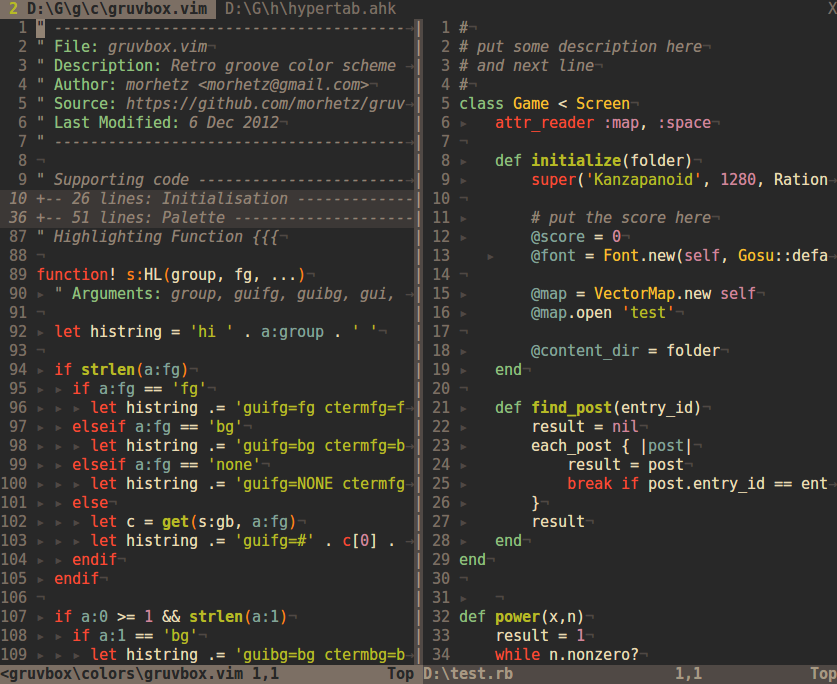
1. Gruvbox
Gruvbox theme is available both in light and dark versions. The theme is designed as a bright them with pastel retro groove colors and it seems to be heavily inspired by solarized, badwolf, and jellybeans.
The main focus when developing Gruvbox is to keep colors easily distinguishable, contrast enough, and still be pleasant for the eyes.
Pros
- Gruvbox is available in both dark and light colors, and the reddish background makes it look consistent when you toggle between the two colors.
- The theme offers multiple contrast settings. There are three variants available, each with different contrasts.
- Gruvbox can be customized in detail. You can customize the size of the tabs, contrast of color schemes, icons of file types, an indentation in the sidebar and more.
Cons
- There is no list of supported editors
2. Molokai
Molokai is a Vim port of the monokai theme for TextMate. The theme was created by Wimer Hazenberg.
By default, it has a dark gray background, and 256-color terminals are also supported.
However, only the dark gray background style is supported on terminal vim at this time.
Pros
- Molokai theme looks great
- It has a strong contrast
- One of the most downloaded themes for an IDE
- The theme is easy to install with Vundle
Cons
- No cons as of now
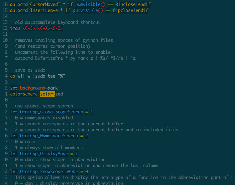
3. Solarized Dark
Solarized Dark is created by Ethan Schoonover. This theme is available both in light and dark mode. It is a sixteen-color palette, eight accent colors, and eight monotones.
Solarized Dark has several unique properties and is designed with both precise CIELAB lightness relationships and a refined set of hues based on fixed color wheel relationships.
The theme has been tested extensively on color calibrated displays and a variety of lighting conditions.
Pros
- The color scheme has been designed with huge background knowledge
- There are ready-made packages for Vim, IntelliJ, iTerm, and Emacs
- Works well with multiple fonts
Cons
- Some of the version may not work such as Vanilla
- The theme is not useful for night use
- Have very low contrast against the background which makes it hard to read.
4. onehalf light
onehalf light color scheme is clean, vibrant, modern, and pleasing light/dark color schemes for Sublime Text, (Neo) Vim, iTerm, and more.
It offers consistent gui colors and cterm, plus matching themes for plugins such as vim-airline, lightline or NERDTree. onehalf light provides harmonious colors and styles for all UI elements and syntax groups.
Pros
- onehalf light is available in both light and dark color schemes
- The theme supports an array of terminals and editors offering consistent color theme
Cons
- None found
5. Dracula
Dracula is a dark theme for Vim, Emacs, Brackets, Atom, Alfred, Notepad++, iTerm, TextMate, Gedit, LightPaper, and more.
Pros
- The colors used are comfortable on eyes and do not pop
- The colors are properly separated so the text is always clear
- It is well designed
- Available for tons of terminals, editors, and more
Cons
- The dark contrast could be hard on eyes
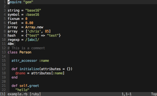
6. Base16 family
Base16 family is architecture for building themes based on carefully chosen syntax highlighting using a base of sixteen colors. Base16 family provides a set of guidelines on how to style syntax and how to cod a builder for compiling base 16 schemes and templates.
Pros
- Base16 family has many color schemes
- The support team of the Base16 family is outstanding
- It is a Solarized Dark scheme and compatible with htop
Cons
- It just offers 16 colors
- Each theme needs manual tweaking
7. Zenburn
Zenburn is a low-contrast color scheme for Vim. It is easy on eyes and designed to keep one in the zone for long programming sessions.
This color scheme has been ported to many different editors and environments.
Pros
- Zenburn has a low blue-light color, which is not harmful to the eyes.
- Low contrast reduces eyestrain
- The theme is color-blind friendly
Cons
- Some may find the contrast to be too low
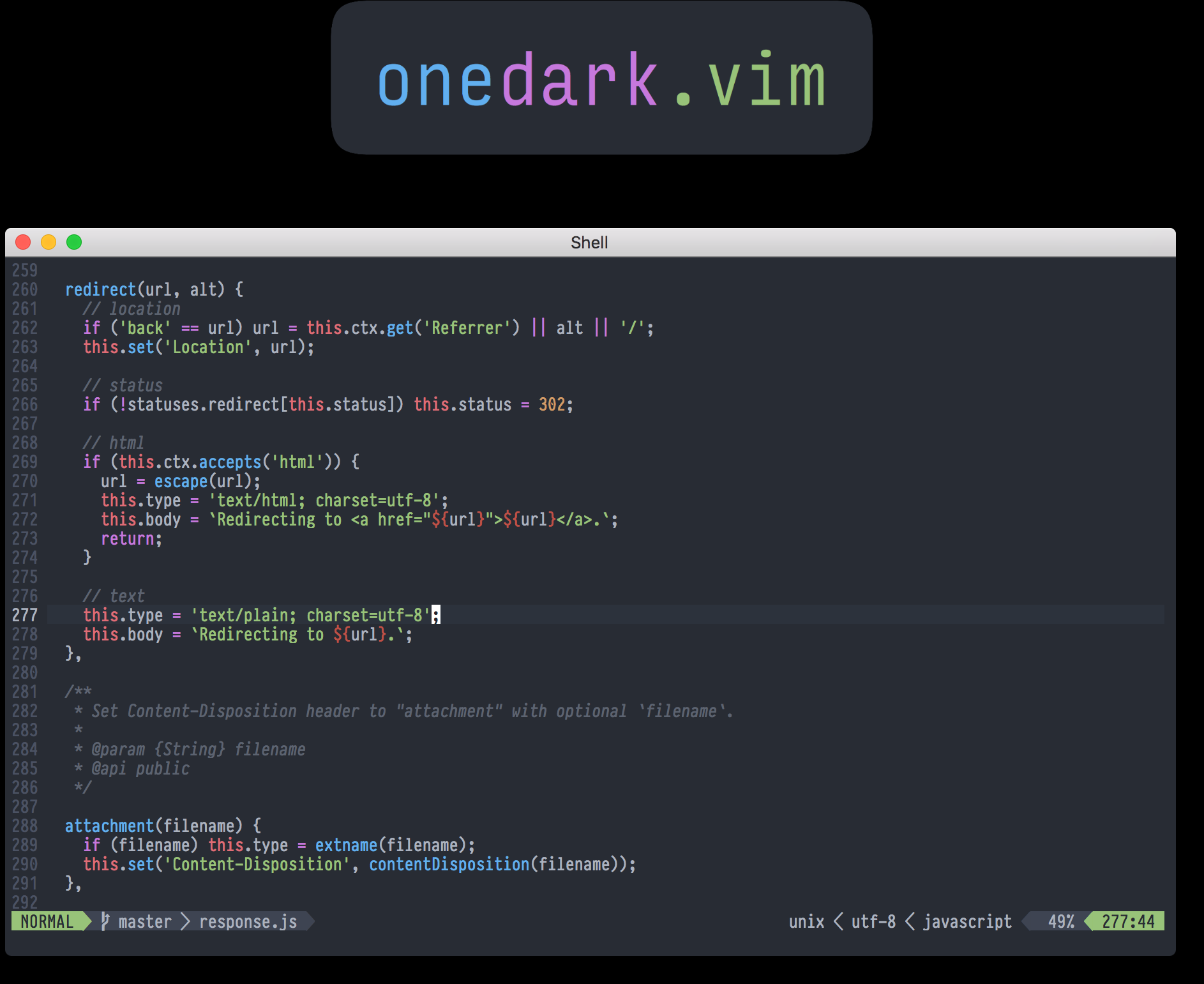
8. vim-atom-dark
The vim-atom-dark theme’s colors are inspired by the excellent One Dark syntax theme for the Atom text editor.
Pros
- Vim-atom-dark color scheme is easy on the eyes
Cons
- None found
9. papercolor-theme light
papercolor-theme light is a light and dark color scheme for terminal and graphic Vim awesome editor. The theme is inspired by Google’s Material Design and has improved code readability and is great for making presentations.
Pros
- Papercolor-theme light has a clean and readable look
- Supports True color/GUI-color and identical 236-color
Cons
- None found
10. Tender
Tender is a dark and fresh 24-bit color scheme for Vim, Airline, and Lightline. This theme is generated by Estilo.
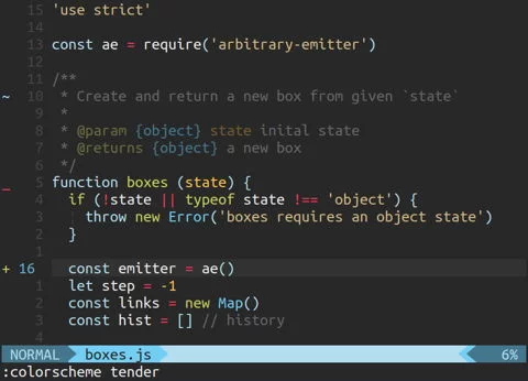
Pros
- Tender is suitable for long coding sessions
- Looks great with nvim and lightline
Cons
- The theme doesn’t go well with the older versions of vim
11. Badwolf
Badwolf is a color scheme for Vim created by Steve Losh. It is a high-contrast color scheme with dark background making it great for coding.
Pros
- A high-contrast color scheme for Vim
- Easy to use
Cons
- Scope of improvement in HTML
12. nord-vim
Nord-Vim is an arctic, north bluish clean and elegant color scheme for Vim.
It is built for Vim’s terminal and GUI mode with true colors and support for many third-party syntax and UI plugins such as bundled themes for lightline, vim, and vim-airline.

Pros
- The unified UI and editor syntax element design provides clutter-free appearance
- Supports a wide range of programming languages
Cons
- None found
13. Jellybeans.vim
Jellybeans.vim is a colorful, dark color scheme inspired by ir_black and twilight. The theme is mainly designed for graphical Vim but supports various color terminals such as 24-bit, 256, 88, 16, and 8.
Jellybeans.vim color scheme is created by Nano Tech.
Pros
- Very versatile, both on dark and light background
Cons
- None found
14. hyper-snazzy
hyper-snazzy is an elegant color scheme with bright colors and was created by Sindre Sorhus.
Pros
- Dimmed colors are available to distract elements, for example, braces, and punctuations
- The colors are consistent
Cons
- Some may find the contrast hard on the eye
15. vim-one
vim-one is an adaptation of one-light and one-dark color schemes for Vim and was created by Ramzi Akremi. It supports true colors and is one of the best Atom Color scheme which is now for Vim and NeoVim.
Pros
- Looks polished
- Clone of Atom theme
Cons
- None found
16. oceanic-next
oceanic-next is a neovim theme inspired by Oceanic Next for Sublime.
It is not a direct port but uses some colors from the sublime theme that are fitted to work with neovim and vim8.
The dark-bluish color theme is classic and quite soothing.
Pros
- A classic theme
- Looks great and isn’t hard on the eyes
Cons
- Some people may find the theme to be challenging to work with
17. ayu-light
ayu-light is a simple, bright, and elegant theme for modern Vim. It is available both in dark and light format.
The light format of ayu-light is exceptionally pleasing and has bright and distinctive colors. This simple theme allows you to work for long hours.
Pros
- Easy on the eyes
- The theme allows you to work for long hours
Cons
- The white background makes the color pop-out
18. Solarized light
In the solarized dark version, we already shared that the theme is available in light version too.
The color palette has a nice feel to it and was created by Ethan Schoonover. Solarized light is one of the most popular vim themes and is available for terminal emulators and code editors.

Pros
- The theme has been nicely created
- Various versions available
- It works very well with different fonts
Cons
- The contrast is low
19. Inkpot
Inkpot is a dark color scheme for VIM created by Ciaran McCreesh. It works well in the GUI and in some 88 color terminals and 256 color terminals.
The theme has been downloaded more than 30,000 times.
Pros
- The dark theme looks great
Cons
- The contrast could be too harsh for a few people
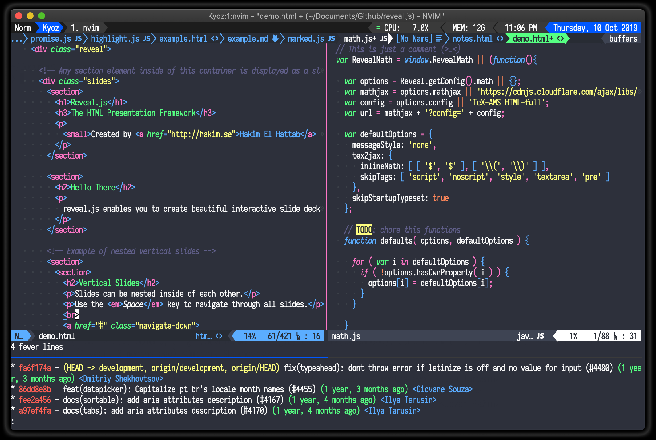
20. Purify
Purify is a clean and vibrant color scheme for Vim created by Kyoz. This color scheme supports almost all languages.
Pros
- The theme is very simple and beautiful
- It is clean and vibrant
- Supports almost all the languages
Cons:
- None found
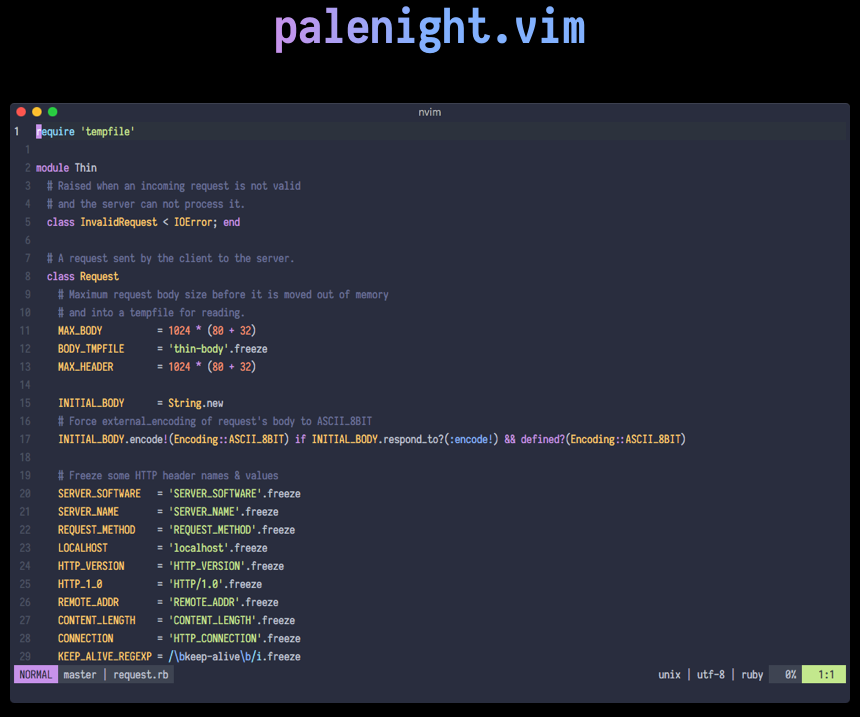
21. Palenight
Palenight is a soothing color scheme for Neovim/Vim. This theme is based on Material Pale Night. The lovely yellow, purple, and orange color makes it look livelier. Drew Tempelmeyer is the creator of Palenight
Pros
- The colors are lively
- Easy to install
Cons
- The bright colors may appear to pop-up
What is the best vim color scheme?
The best Vim color scheme is subjective and depends on personal preference. However, based on popularity and user ratings, some of the top-rated Vim color schemes include:
- Solarized Dark
- Gruvbox
- Molokai
- onehalf light
- Dracula
- Base16 family
- Zenburn
- nord-vim
These color schemes are highly rated by Vim users for their clear and readable syntax highlighting, visually appealing color combinations, and compatibility with different environments and terminals. Ultimately, the best color scheme for you will depend on your personal taste and the type of work you do in Vim.
Conclusion
Depending on the taste of the user, you may choose to go with the dark or light color vim themes.
All of the themes that we have mentioned here are popular, and you can pick any of them or multiple of them and keep changing the vim themes from time to time.