Principles of Art in Design and How to Use Them
The elements of art and principles of design are tools for a visual artist that helps the person do creative art work. They can be defined as different criteria’s that will explain how the many visual elements are going to be arranged.
Of course, different artists will use these tools and interpret them differently, which may end up differentiating one work from another.
Art is always a gray area when you are trying to determine whether a work is great or just average. It can also differ from time to time.
For example, an artist from one era can be mocked, and yet, after the person’s death, in another era, his or her work can become hugely revered. A classic example of this is Vincent van Gogh. The principles of art can be used to some extent for combating this gray zone.
The principles of design art help us understand what makes the work great objectively, which is why understanding the principles is so important.
There are various art design elements, such as color, rhythm, movement, contrast, white space, repetition, alignment, and others that create the composition and help us understand the art design and appreciate its beauty. Then there is art balance too that works below the surface.
The Basic Principles of Art
Here are the different design principles in art and design with an understanding of how they work –
Emphasis
Emphasis refers to the design’s focal point. It also refers to how important each element is in a design. Let us assume you are creating the visual design of a poster for a concert. In this, what should be the first information the audience must know? Will this be the concert’s venue or the name of the performing band? There is also the issue of the cost and day of the event. So, you see, there can be many different elements.
Now, you must organize all this information for creating the design layout in such a way that the communication is effective. If the name of the band is very important, then it can be at the center of the design. If the venue is more important, then you can mention it in the boldest text. Select strong colors from the color wheel to highlight the elements you want.
Balance and Alignment
This refers to how much weight each element has in the composition. This is the sense of the work – an imbalance here will make the viewer feel uncomfortable. The viewer won’t be able to appreciate the work.
All the visual design elements have their own weight. It can be from texture, color value, or the size. You won’t certainly want to keep all the furniture at one single corner of the room. Similarly, you don’t want to crowd the composition by keeping all the heavy elements in a single area. If there is no balance, the viewer eye won’t be able to appreciate the work.
You can achieve balance and alignment in the following ways –
Proportion
Proportion refers to the weight and visual value of the elements in your composition and also how they are relating to each other. This helps the creator approach the work in sections and not as a whole. When you group related items, you can focus on smaller things. Remember, you can achieve proportion, only when all the elements of the design are placed thoughtfully and well-sized. You will achieve proportion once the balance contrast, design balance, and alignment are all working well.
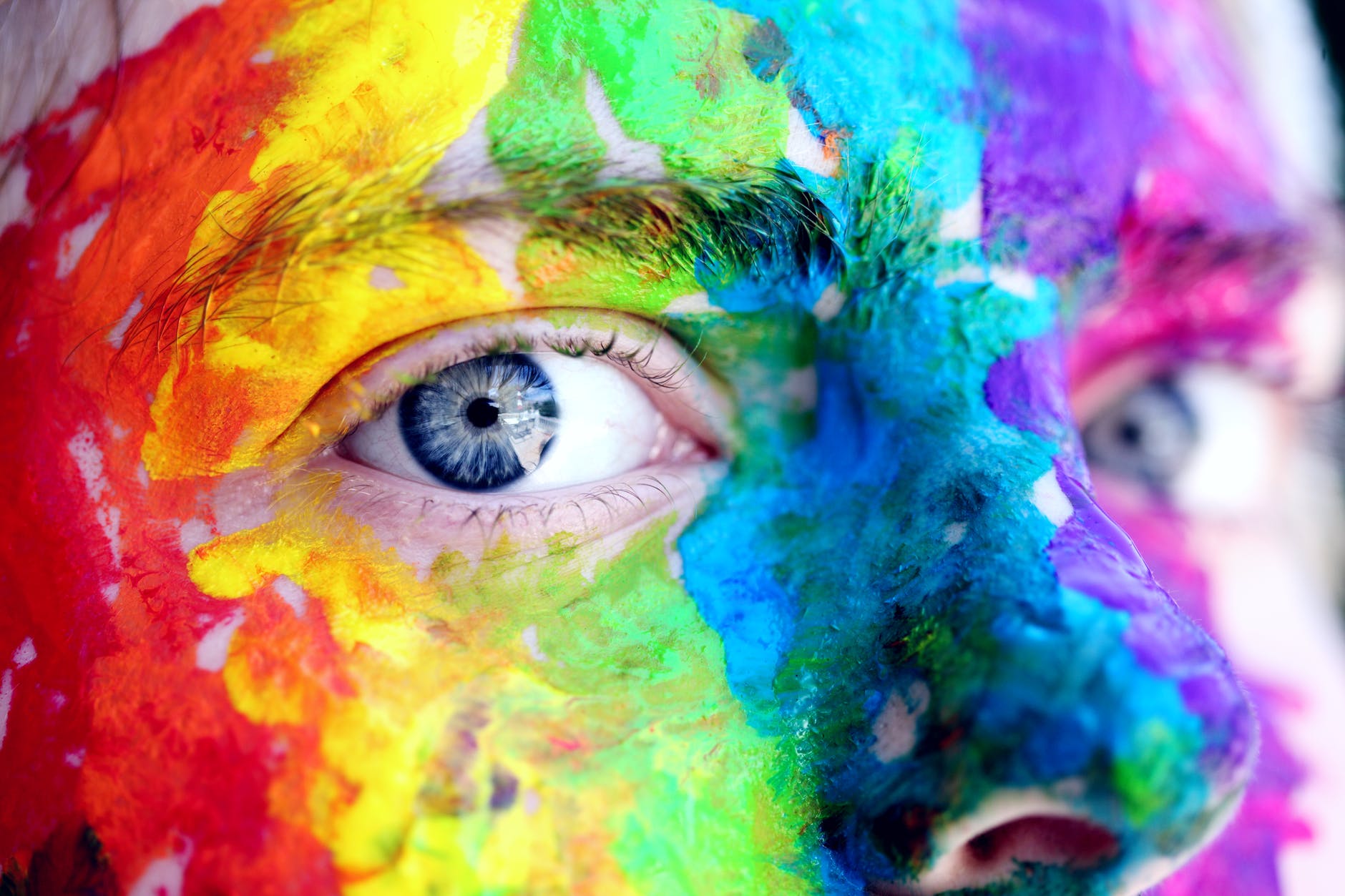
Contrast
Contrast provides difference between the elements in the composition in such a way that one element looks stronger compared to the other. Contrasting elements will always attraction the attention of the viewer when they are placed close to each other. In fact, these are the places that are likely to be seen first, which is why artists will use this often.
Make sure that the background and color are both significantly different. This will make the work stand out and get noticed. There can be other examples of contrast, such as positive/negative space, for example.
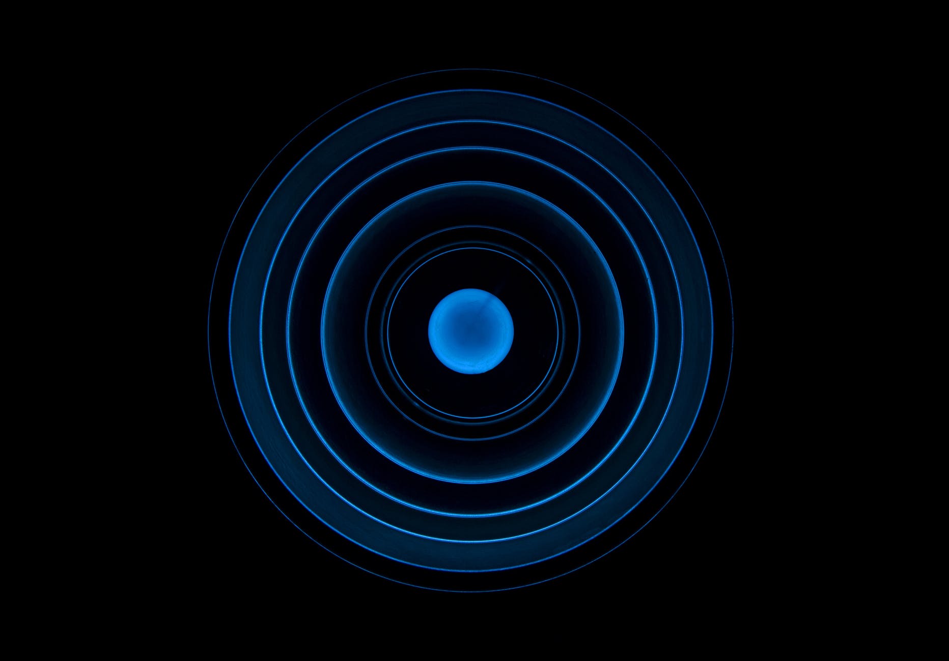
Movement and Rhythm
Art can also be influenced greatly by movement and rhythm. Movement refers to controlling elements in the composition to make sure that the eye moves from one area to the next seamlessly to ensure that the information you are trying to communicate is effective. Movement will create the story you are trying to say.
Adjust the harmony and rhythm if you feel your eye is getting stuck anywhere and not moving easily like you want it to. This could be because an element’s composition is too bold, too big, or not in the right place. Balance art is what you want to achieve.
Repetition
Repetition will often unify and strengthen a design, which is why this visual element is so important. For example, it may seem like an error if you are using orange italic Broadway style just once. However, this will look like the design motif when you use it repeatedly. They will work together to give you the effect you want.
White Space
Negative space or white space refers to what you don’t have. This is the empty space around the elements in the composition. The space gives the composition more room. It works as a relief because too many elements can make the space crowded.
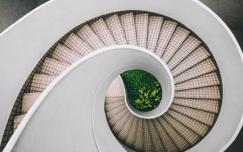
Pattern
Pattern refers to an art element or any combination of them getting repeated uniformly. You can turn anything into a pattern by repeating. Weaves, grids, and spirals are a few classic patterns.
Unity/Variety
Finally, the visual elements must also fit together well. Yes, there should be variety because too much of unity will be monotonous. But remember, too much of variety may also be chaotic.
How to Use the Principles of Art in Design
Design can be greatly influenced by how the principles are applied. There are many design examples that show their effectiveness. So, just remember these basic principles when you are creating. However, having said this, there is no need for the design to follow all the above rules strictly to be good. Visit this website to learn more about different design events and you will see that many designs ignore some principles and are yet awesome.